CHALLENGE
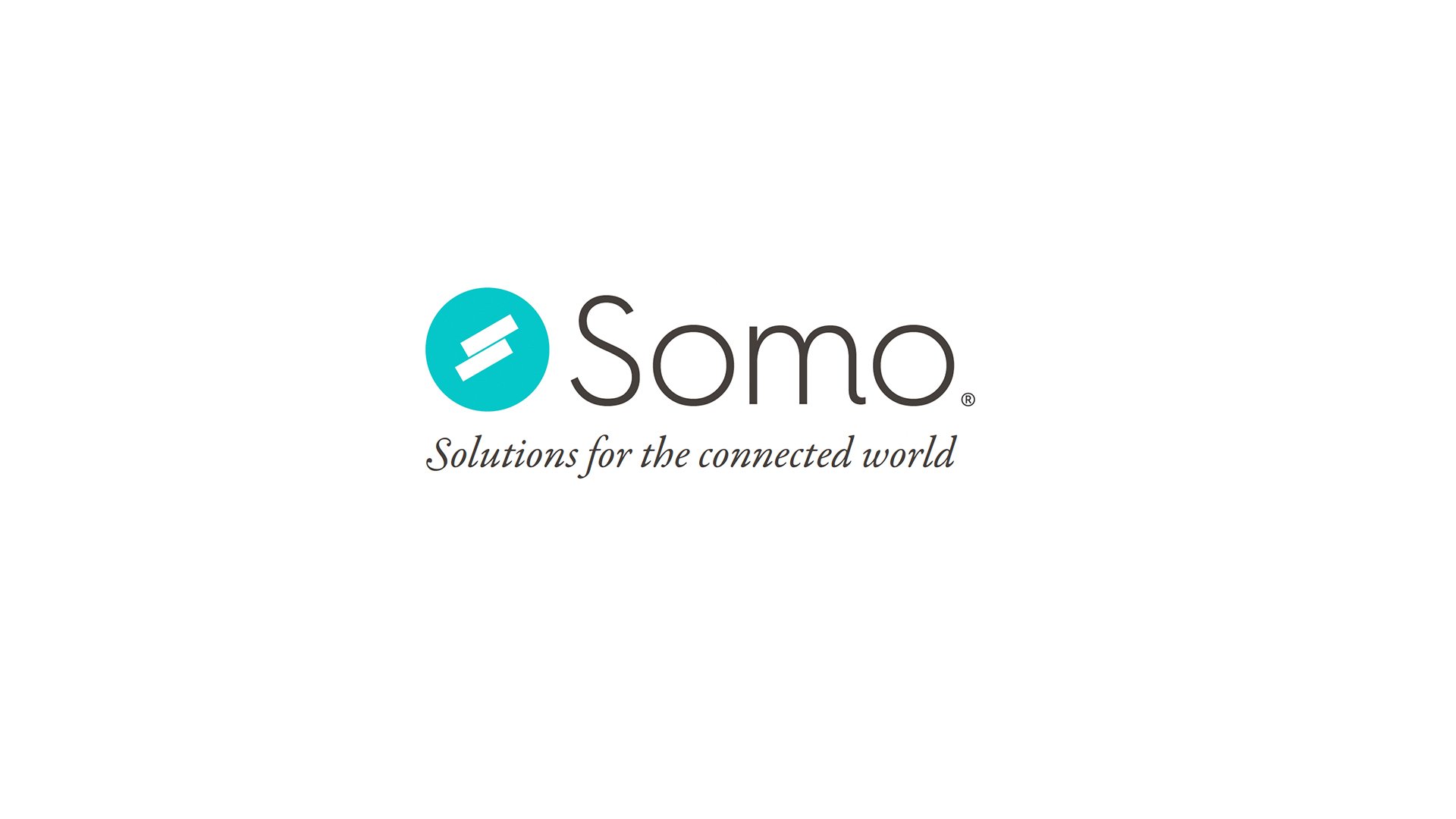
Somo, a growing digital product agency, faced the need to rebrand and assert its leadership in the mobile-first industry, departing from its existing logo that no longer resonated.
INSIGHT
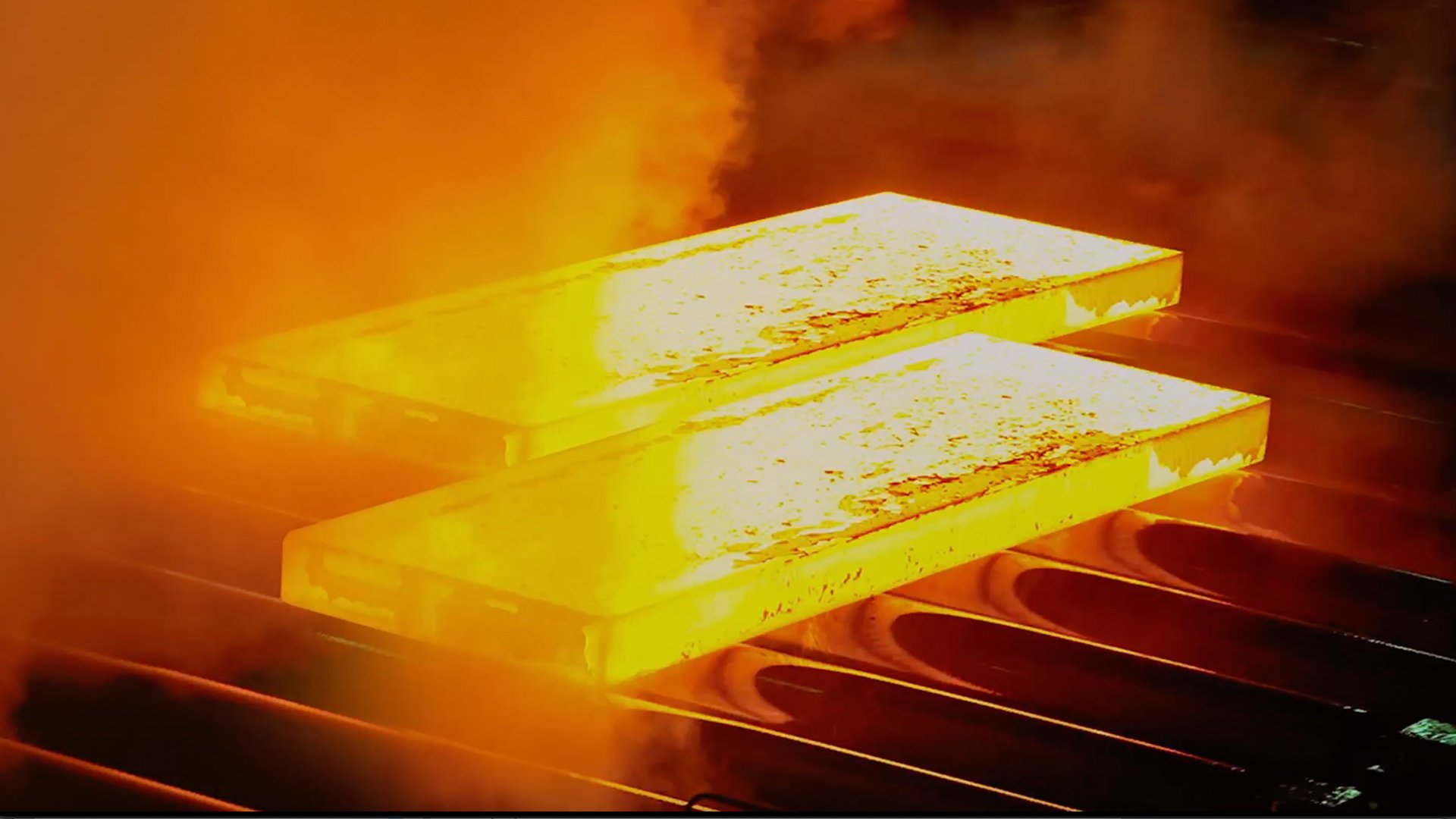
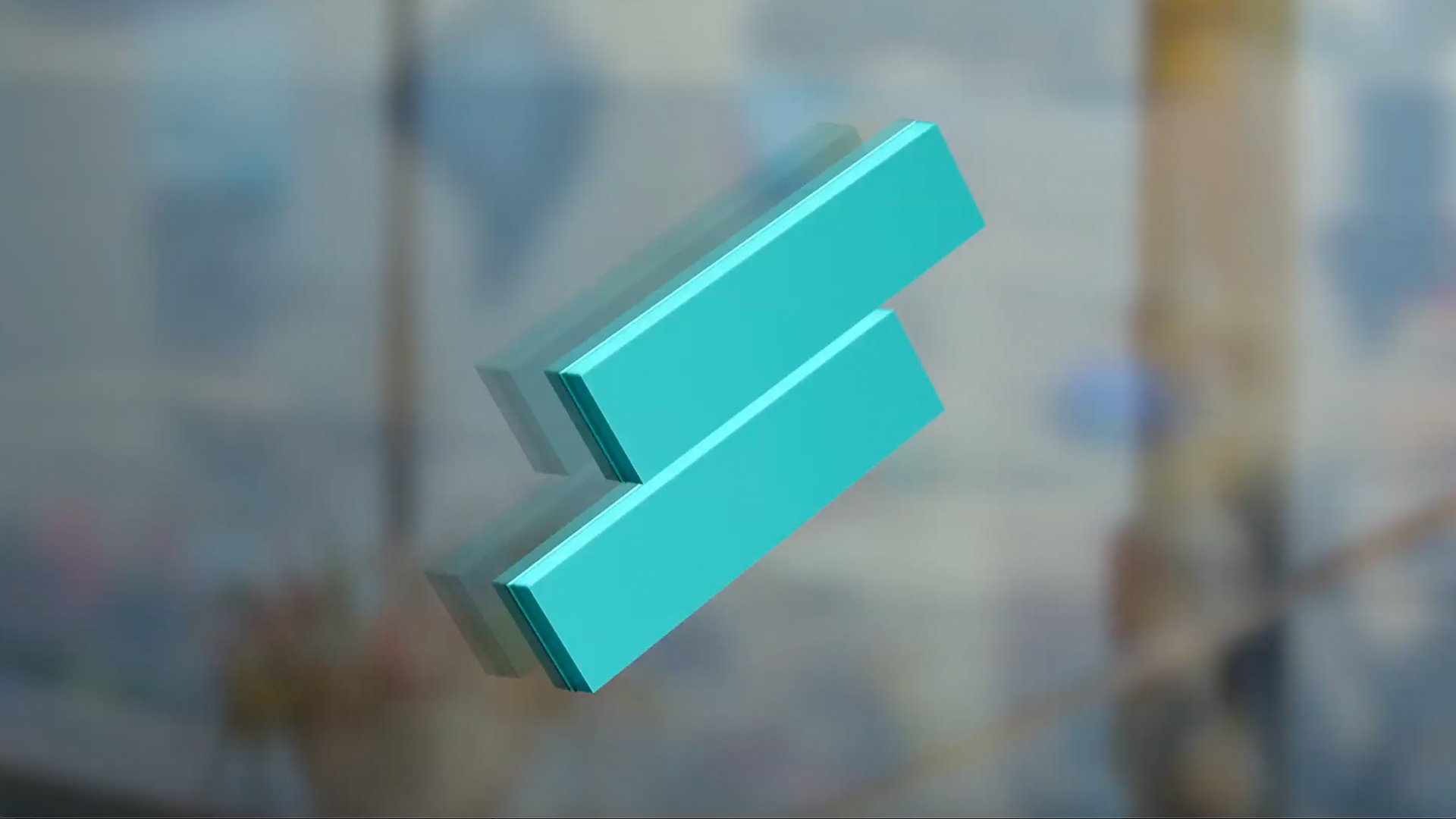
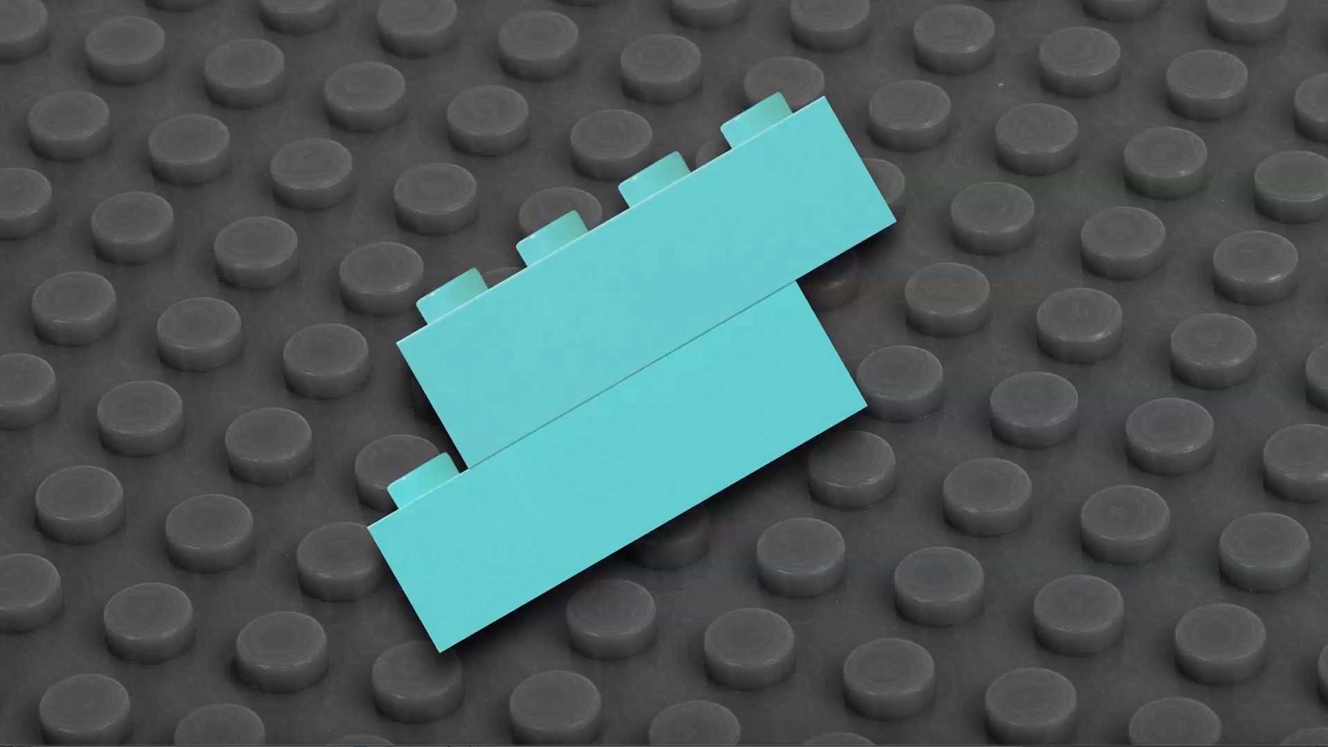
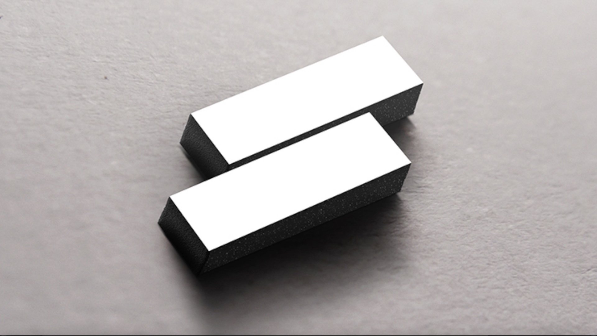
Recognising the need to represent dynamism and innovation, Somo sought a logo that embodies change and energy. The new logo, named "The Somo Spark," was designed within a 16:9 aspect ratio, featuring a dynamic arrow slicing through, splitting an atom, forming two hemispheres resembling yin and yang, and shaping an abstract 'S'.
SOLUTION
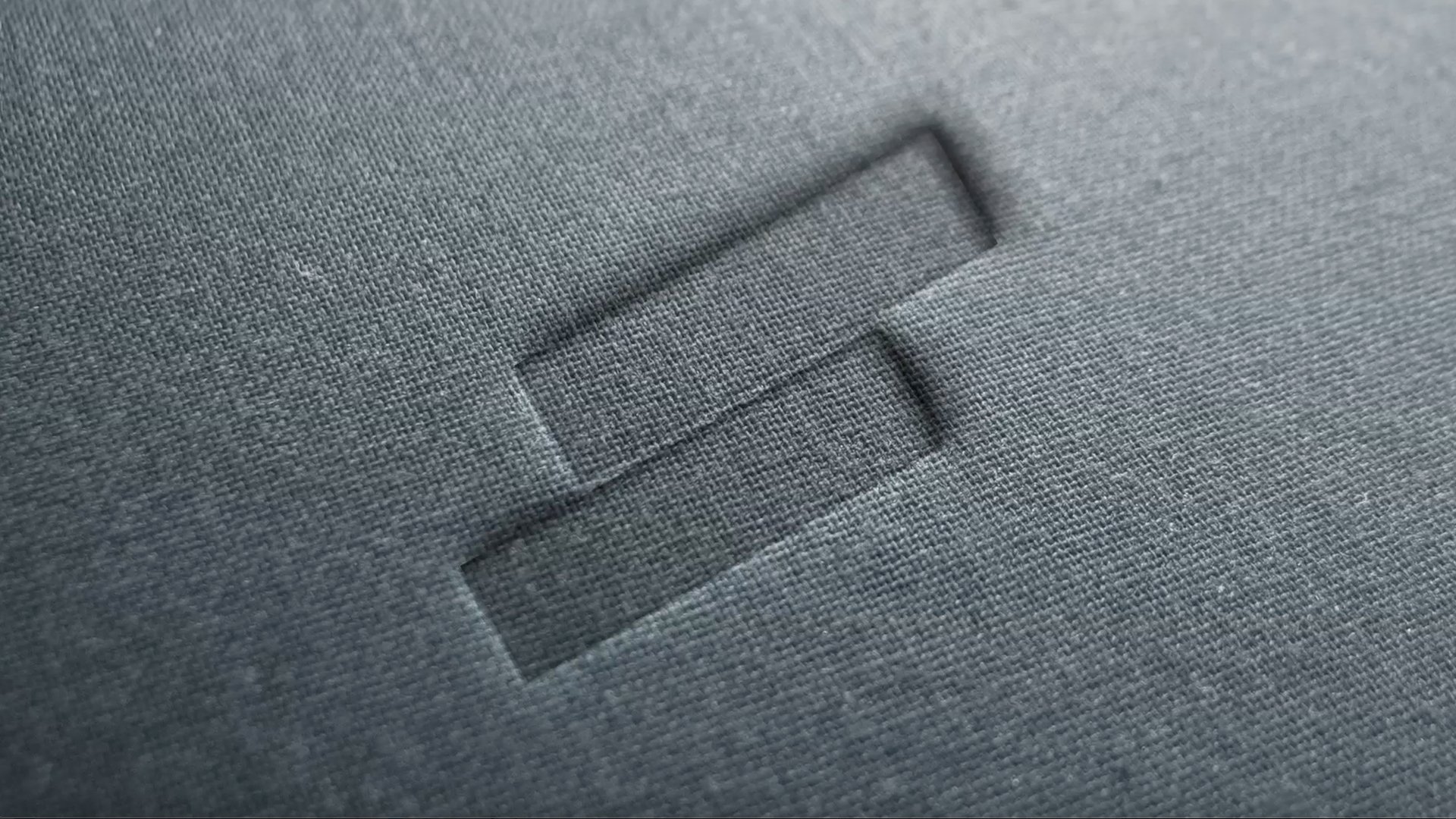
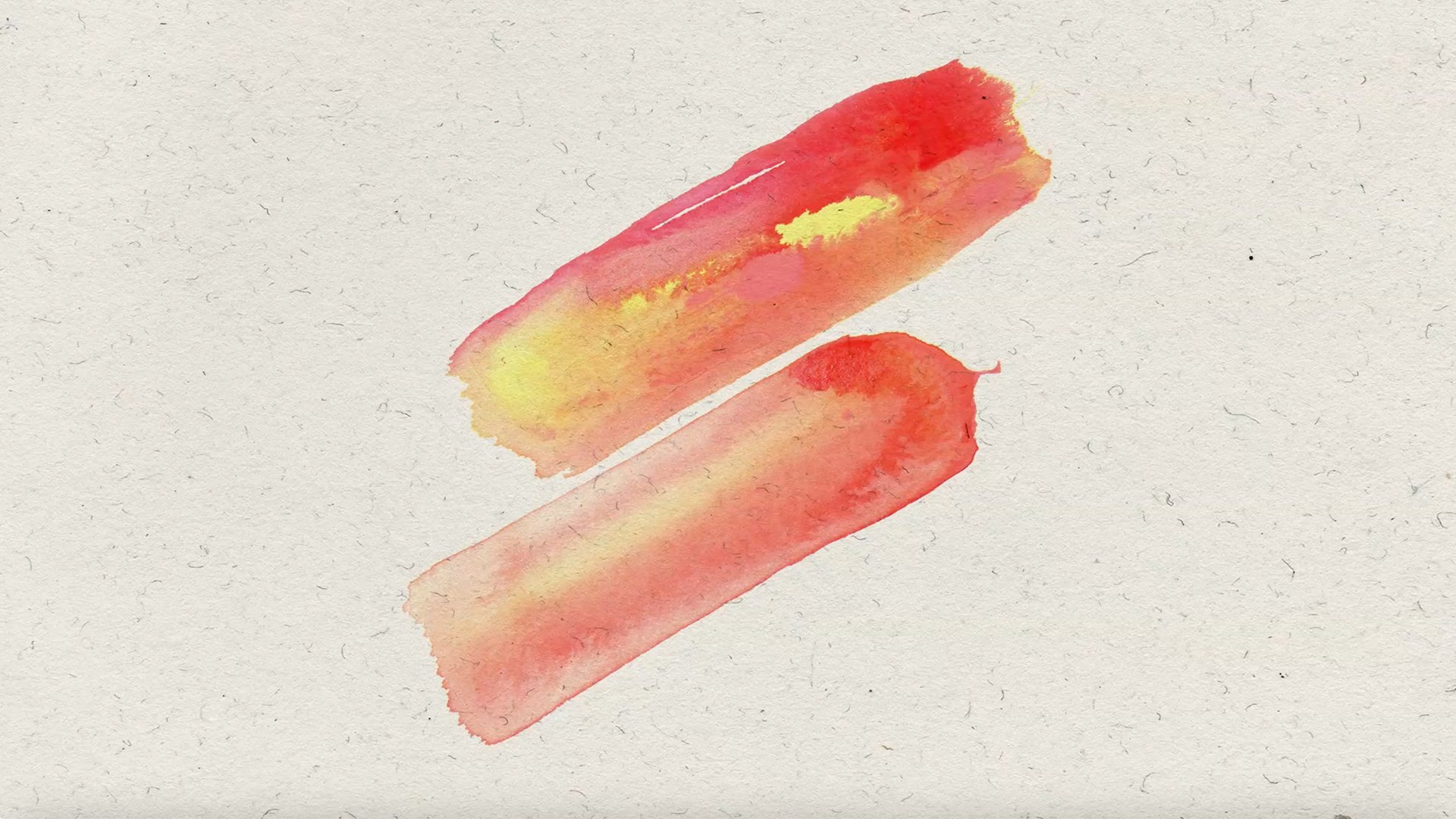
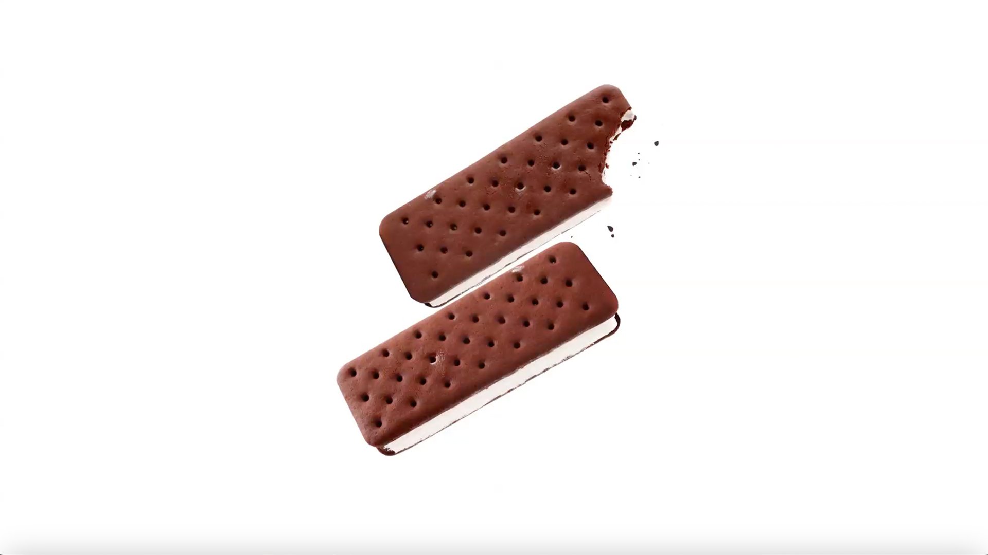
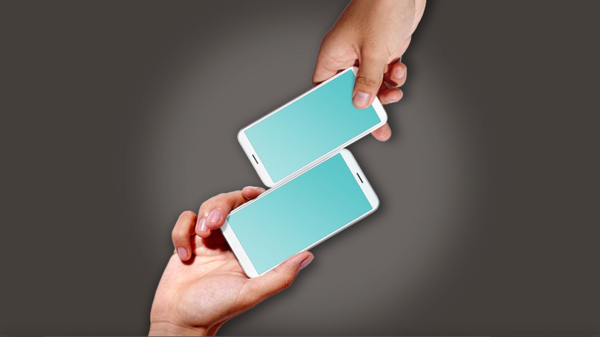
The resulting logo, two smartphones turned 45 degrees, created an adaptable S shape. This flexible mark was intended to communicate authenticity, professionalism, and energy, aligning with Somo's essence. The logo was applied across various platforms, from on-air branding to YouTube content, interactive video units, Facebook games, installations, and promotions, effectively engaging prospects during early stages of interaction. The rebrand successfully enhanced brand perception and recognition, driving increased purchase intent and positive reception across global markets.